
St Luke's Charity Card Challenge.
I have been meaning to join in with this challenge blog for a while now but I've only just got round to doing so. Not only does this blog raise awareness of the charity but if you send them your card they can sell it to raise much needed funds - did you realise that they have to find 4 million pounds a year? Anyway I'm having a go, here is my card
 The challenge is to produce a card that is Black and White and one other colour. You can use tones of the third colour and Grey.
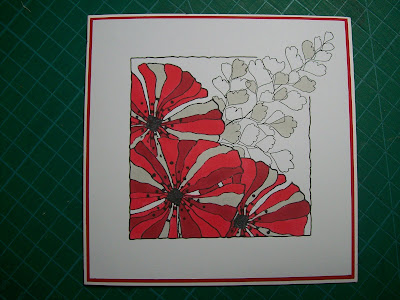
So today I have combined one of my own stamps and the fern frond from Growing Green. My third colour was red as when I designed this stamp I had poppies in mind. I coloured it in with Promarkers and hand drew the frame with a black fine liner. As in my previous card I masked off the flowers with post it notes to enable me to over lap and add depth.
Please pop over and check out the St Luke's challenge and I will be back soon - Jacqueline xx


What an eye catching card Jacquline...the red really pops out.. thank you for joining in our challenge over at St Lukes charity card challenge..hope to see you next month
ReplyDeleteAnne
I really like this 'popping out of the frame' thing you're doing at the moment Jacqueline. The stamps look great and the card is for a very good cause too. Vx
ReplyDeleteThis is just stunning! I love the way the fern comes out of the frame. Thanks for playing along with St Luke's Charity Card Challenge. We hope to see you again next month!
ReplyDeleteYour card is beautiful. The red of the poppy`s really pops against the grey ferns. Thank you so much for joining us at St Lukes Charity Card Challenge. See you next month.
ReplyDeleteLynne xxx
Gorgeous card and I love the combo of images.
ReplyDelete